![]()
![]()
|
|
|
|
|
|
|
|
|
|
|
|
|
|
|
|
|
|
|
|
|
2013
Hartford Marathon Poster
The Making of a Digital Fantasy
By
Andy Yelenak
October 27, 2013
An Idea Too Good for Just Any Year
In August of 2012 Beth Shluger, the Hartford Marathon race director, gave me a call, asking for a poster design for that year's race. She was looking for something different, maybe a retro-sixties style, colorful and fun.
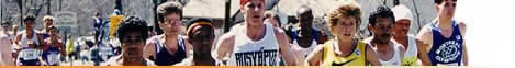
I started doing my research of sixties art, the psychedelic posters, the "Yellow Submarine" influence...and then my wife Merrill had a suggestion, "Why not do a scene with the finish line arch but with an Abbey Road homage, with runners in the crosswalk?"
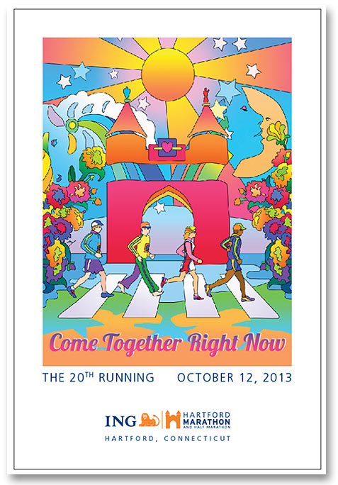
Sixties style, with runners in an Beatles' "Abbey Road" pose? That is too good a concept for just any year, we need to save it for the 20th running of the Hartford Marathon in 2013!
So I did a more traditional painting for 2012, with the kids' runs as the subject, and work began immediately on the digital marathon fantasy for 2013.
How Do You Paint a Sixties' Poster?
I'm a traditional realist when it comes to painting and I use traditional techniques, watercolors, oils, classic methods. This would require vibrant, clean color, a two dimensional cartoony fantasy. My best chance to achieve that look? The computer.
The intense color available in Photoshop, the smooth multi-color gradient fills you can create so easily on the computer would make this image as "pop art" as I needed, and would be very forgiving of mistakes and edits.
The Fun Can Be Surprising
To break out of doing a conventional image of the Soldiers and Sailors Arch at the finish line, I needed to add something cool, something surprising.
I was thinking of hiding faces in the background, a la Peter Max, when it hit me, a face in profile could be mirrored with a second face, they could interlock. If done right you would see one or the other first, and then discover the second. Mindblowing! And even better, since I'm doing the stars, sun and sky, one face would form a quarter moon.
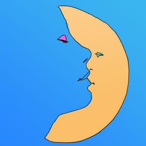
I tried to indicate the faces very simply, positive and negative space, minimal lines with just suggestions of form. The woman's pink eyelid could be some kind of butterfly...You're freaking me out!
Doubling Up
To keep the phantom images going, and to add to the celestial mood, I needed a cloud carousel horse...Of course! There is a vintage carousel in Bushnell Park near the finishline, complete with carousel horses.
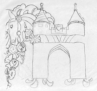
I sketched a horse's head whose mane would form a cloud. To disguise the horse I overlayed it with mums, the flowers that grace the homestretch of the race.
Okay, How Whimsical Can We Get Here?
Next up, the runners in "Abbey Road" poses. My first sketch of the people.
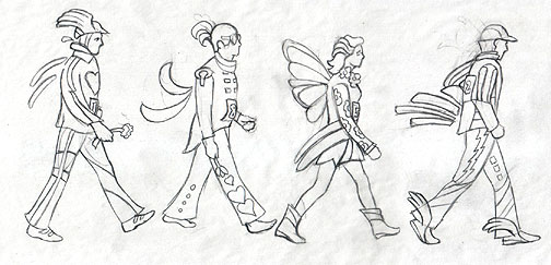
And then in color.
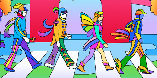
Feedback on this wasn't great. It doesn't say "runners", too offbeat, doesn't represent marathoning. A little less whimsy, a little more reality. No problem..Take two!
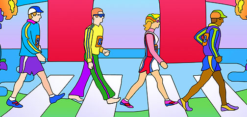
Now we have runners! Or at least walkers. Let's try one more with runners running, take three!
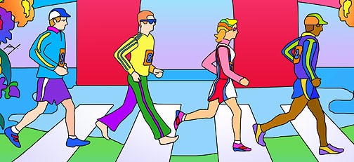
Success! Here's the complete final design.
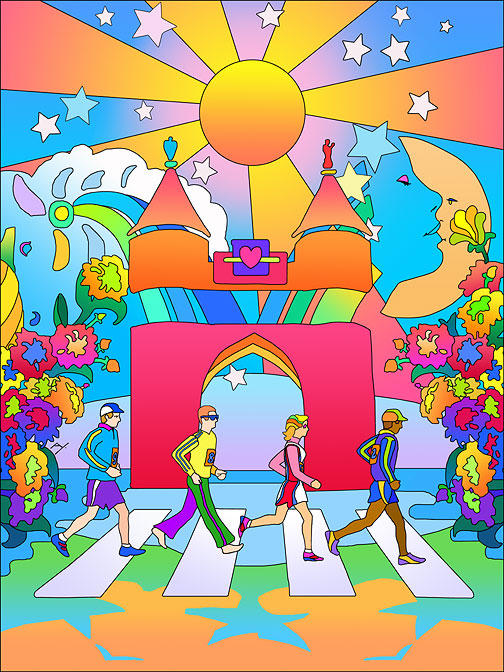
I let the middle section of the arch go missing to add to the "lost and found" feeling of the image. The flowers are a symetrical mirror image of each other on the right and left. I also added a flower near the woman's face, her expression could be that she's enjoying its fragrance. Colorful enough for you?
Letting the Color Run
As 2013 began the 20th running of the Hartford Marathon was promoted in many running magazines using my colorful design. Runners World, Marathon & Beyond and New England Runner all had full page ads jump off their pages.
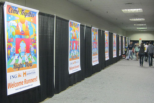
At the race expo large versions of the poster towered over your head.
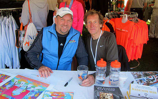
I spent race day hanging out with marathon legend Bill Rodgers, meeting runners and signing posters.
The race medal itself used the poster design, many people said they selected this marathon just to get that medal...Awesome. The design also appeared on the race program, a race button and the VIP passes.
I hope everyone enjoys this retro marathon fantasy. The poster is available from the Hartford Marathon Foundation.
Andy
Yelenak
e-mail: andy@runningpast.com
RP
News | Articles | Trivia
| Profiles | Vintage
Video | Vintage Photos | Contact
Us | Site Map | Home
Cards | Posters
| Autographs | Books
| Pins | Prints
| Authentics | Sportscasters
| How to Order
©
Running Past LLC All Rights Reserved mail@runningpast.com