|
|
|
|
|
|
|
|
|
|
|
|
|
|
|
|
|
|
|
|
|
Lydiard and Snell
A Portrait of New Zealand's Best
By Andy Yelenak
Arthur Lydiard and Peter Snell made an unbeatable team. With Coach Lydiard's guidance Peter Snell won three Olympic gold medals and set five world records.
In January of 2004 I was contacted by Rich Benyo, editor of Marathon & Beyond Magazine. He planned to run an article in the May/June issue about Snell and Lydiard, and needed a painting for the cover.
I've always loved doing portraits, especially when I can combine one with an action shot. The subject of coach and runner fit this concept perfectly. A montage of Lydiard looming behind Peter Snell would make a great cover.
The Base Drawing - Febuary 18, 2004
|
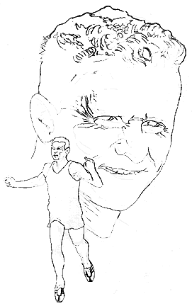
I started with a base drawing done in pencil on double thick plate finish illustration board. In this composition I like the contrast of Lydiard facing to the right while Snell is moving to the left. I experimented with different arrangements but this seemed to be the most dynamic. I was concerned with overlapping Snell's figure onto Lydiard's face, and with the scale of the two images in relation to each other. I wanted to achieve a sense of balance between the two, so I kept the runner fairly small and tucked him in between the ear and mouth of the face. There were no awkward conflicts in this position, and when the text and masthead of the magazine are added to the cover, much of the top of the portrait will be covered, so it will appear smaller.
|
Blocking in the Color - February 22, 2004
 |
|
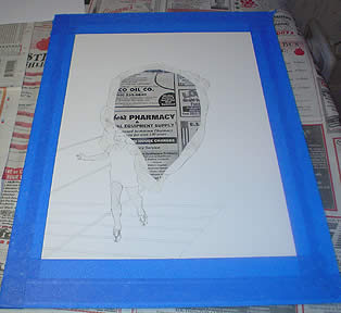
The
base drawing gets masked off. The background is airbrushed in first,
then the flesh tones. This ensures that the flesh tones will have
a clean look.
|
 |
|
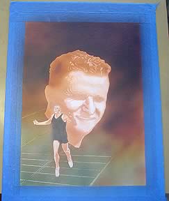
After
airbrushing the entire painting with dyes, I pick out highlights
by brushing on water and blotting it with paper towels. This starts
to establish the patterns of light and dark and giving a sense of
the form for the figures.
|
Finished - February 29, 2004
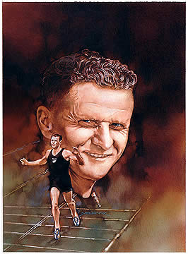 To
complete the rendering I use colored pencils. They go over the airbrushed
dyes very easily and allow for tight control in adding the details.
I was careful to establish a strong value pattern, light against dark and dark against light. I didn't want the runner to get lost or overwhelmed by the portrait, so I kept nice highlights on his head and shoulders, while playing the values down directly behind him on the portrait.
To create
a little depth I like to let the shadow side of forms blur into the background,
losing that hard edge. The shadow side of Lydiard's head recedes into
the darkness, while the highlights of his face jump forward.
Many thanks to Nobby Hashizume for help with the photo research!
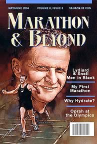 |
Here's a mockup of what the magazine cover may look like. I'll add a scan
of the real cover when its printed. |
Andy
Yelenak
e-mail: andy@runningpast.com
Click to see more of Andy's work
RP
News | Articles | Trivia
| Profiles | Vintage
Video | Vintage Photos | Contact
Us | Site Map | Home
Cards | Posters
| Autographs | Books
| Pins | Prints
| Authentics | Sportscasters
| How to Order
©
Running Past LLC All Rights Reserved mail@runningpast.com


