|
|
|
|
|
|
|
|
|
|
|
|
|
|
|
|
|
|
|
|
|
A
Portrait of Old Kel'
By Andy Yelenak
Johnny Kelley competed in 61 Boston Marathons.
To anyone who knows
what it takes to run one marathon, that is a staggering accomplishment.
It is such an unbelievable
achievement that in the spring of 2003 Marathon
& Beyond Magazine will publish an article claiming that Johnny
is the greatest distance runner ever.
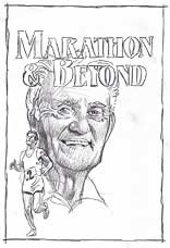
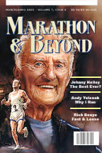
I was commissioned to create a portrait of Johnny for the cover of that issue. The concept is to juxtapose Johnny in his prime with a portrait of how he looks now. There is not much room on the cover of Marathon & Beyond, the magazine measures 6" x 9", so the painting needs a tight layout, leaving enough room for the masthead and article titles.
Blocking It In - October 19 & 20, 2002
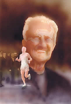 To
the left is my painting at the "block in" stage. I have completed
a very accurate drawing in pencil on 3 ply smooth finish drawing paper,
and then painted over the drawing with an airbrush and dyes.
My technique is to fill in the large areas of color with the airbrushed dyes, which are like watercolor, and then draw over that with colored pencil. This allows me to avoid the graininess that using colored pencil alone would create.
It also establishes the patterns of light and dark, the color scheme and the main areas of contrast in the painting. I've found that contrast is critical to creating a focal point or center of interest in my paintings.
In this case I want the running figure to stand out the most, and the secondary point of interest should be the eyes of Johnny's portrait.
If you squint just a bit at the block in, you'll notice the runner already stands out against the background, your eye is drawn to that figure first.
Rendering
the Details - October 22 & 23, 2002
 |
 |
|
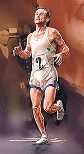
Blocked
in figure
|
Rendered
figure
|
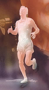
Here I've started drawing the figure with colored pencils. I work "light to dark", reinforcing the highlights with white first, then going to a medium flesh tone, trying to render the musculature. I'll go still darker with deeper browns to create the modeling of the shadows, and finally use black for the darkest areas. The figure here measures 7" tall. Going from the block in stage to the completed rendering took about 9 hours.
You can see I've drifted into the background a bit, adding some detail to the spectators. I'll leave the rest of the background to the end, after I've finished the more important section, the main portrait.
Johnny's Eyes - October 25 & 26, 2002
 |
|
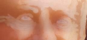
The
eyes blocked in.
|
 |
|
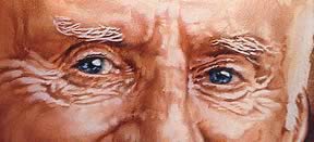
The
eyes completed.
|
This area took a lot of concentration. Each eye took about three hours to complete. I really focused on getting a glistening, crinkled look, so much character is expressed with the eyes. I used a mirror to look at the detail of my own eyes to complete the rendering, especially looking for the areas of red along the insides of the eyelids and in the corners.
I will still go back with white paint and touch up the highlights on the eyes to really make them snap.
Finished - October 30, 2002
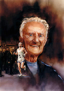
Here's the finished painting. There is a lot of extra space around the subject to allow for shifting the portrait in any direction. The magazine's graphic designer will layout the masthead, headlines and other elements around the portrait and I wanted to give him the maximum flexibility.
What the Cover Should Look Like
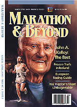 |
This is planned for the March/April 2003 issue of Marathon & Beyond Magazine. Here's a scan of the actual cover. Andy
Yelenak Read
more about Johnny Kelley's career
|
RP
News | Articles | Trivia
| Profiles | Vintage
Video | Vintage Photos | Contact
Us | Site Map | Home
Cards | Posters
| Autographs | Books
| Pins | Prints
| Authentics | Sportscasters
| How to Order
©
Running Past LLC All Rights Reserved mail@runningpast.com


